Palladio is a new web-based platform for the visualization of complex, multi-dimensional data created and maintained by the Research Lab at Stanford University called Humanities + Design. As a side note, it looks like the lab has just produced another free digital tool, Breve: http://breve.designhumanities.org/.
Stanford is making big strides in the field of digital humanities, but more importantly free and web-based, in other words it does not required downloaded software or paid subscriptions, membership, etc. In many ways, Palladio is the first step toward opening data visualization to “any researcher” by making it possible to upload data and visualize within the browser “without any barriers.” There is no need to create an account and they do not store the data. Palladio also offers several video tutorials are available an a sample dataset to try out.
1) New users should begin on the homepage where there is an inviting and obvious “Start” button. The next page allows the input of data using a drop method rather than the typical file upload.
2) Once the original data loads — a primary table is generated that breaks down the information by category (as listed in original metadata). From here the user can edit and add layers by clicking on the categories and uploading additional data sets.
3) After all data has been entered, users can go to map or graph in the top left hand corner depending on the type of desired visualization.
4) Palladio is not primarily intended for use as a geo-spatial service but it does provide some mapping which allows users to see the geographical distribution of data.
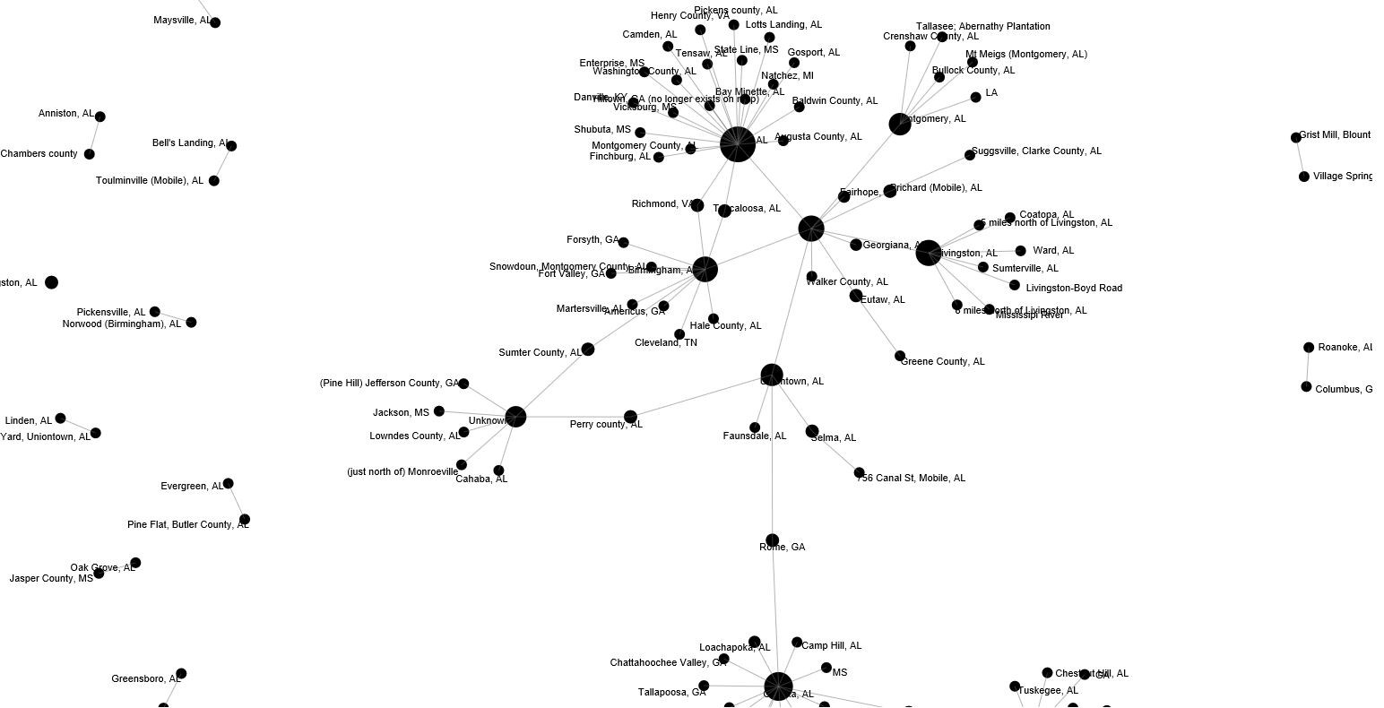
5) Perhaps its most impressive function is as a graphing tool that can be manipulated to show any given combinations of relationships using options found in the settings. The most important categories to consider are “Source” and “Targets” as this creates the base nodes (circles) and the connective data web.
6) There are additional filter and what Palladio calls “Facets” that allow the user to further filter/organize information based on sub-categories found within the data as well as a timeline function, which for our activity was not a factor.
7) Finally, when the graph is complete and organized as the user would like, there is a quick and easy download option to SVG format. It would seem that a jpeg option would also make the platform more user-friendly.
Unfortunately, in its quest and success as an open-source program, it limits the user in saving and/or sharing visualizations. For example, you can download json or svg but there is no sharable link or embed option (that I can tell). An embed code to add interactive graphs to this blog entry for example would have been great. Still, Palladio and other web-based, open-source, user-friendly programs such as this are going to be a gamechangers not only for digital history or digital humanities but for academic research, publication, and pedagogy on secondary, undergraduate, and graduate levels.