Categories
Uncategorized

Reading Response

Module Four’s main topic was “Collections.” The readings and activities were thoughtful and engaging. Review readings about the many different meanings and definitions related to the concept of an “archive” and metadata were both great reminders of the importance of building content grounded in a clear purpose. Interfaces and collections are also essential elements that must be developed carefully with both short-term and long-term goals in mind. Readings that shed light on these issues and collection /content organization included:

Smithsonian Team Flickr
Generous Interfaces

It’s All About the Stuff

These articles helped me to brainstorm when thinking about nashvillesites.org. For me, the readings in Module Four stressed the solid building blocks needed at the outset of any digital project. This Module’s readings emphasized the need to thoughtfully define, outline, and plan digital history projects with a clear audience, purpose, and goal. In writing and revising two personas I am much more focused on the types of people I hope to engage through my project and this will guide the project’s development going forward. In gathering and posting 15 items and organizing them into a collection via Omeka was done with these factors (audience, data, sources, interface) in mind.

It is important to remember that without a general audience, public history is limited to a small group of creators and scholars. In order to attract a general audience, a digital project must have a compelling narrative. This was the focus of Module Five. As Steven Lubar writes in “Curator Rules,” project creators and managers should also remember that users are “thinking beings.” As a digital humanist creating a digital story, I will need to carefully balance content with curation; information that is as entertaining as it is educational. This can be accomplished through a deliberate and consistent effort to synthesize content and create a narrative interpretation of historical markers in the downtown Nashville area.

As Suzanne Fischer notes in “Developing your Synthetic Powers,” synthesis is key to a successful project that engages a wide audience. Fischer writes, “In your source-gathering, seek patterns. . . read and reach out widely and know your constraints.” Fischer concludes that what is of interest to the historian creating the project is likely of interest to the project’s potential audience. She concludes, “Latch onto what interests you. . . .If you can’t stop thinking about a story you heard, it probably belongs in the project.” In Eavesdropping at the Well, Richard Rabinowitz reminds us that as historians we must move from exhibits to narratives and from narratives to experiences. His and other articles focus on the importance of storyboarding, prototyping, visual/spatial design.

Activities and readings in this module forced me to move beyond the data/content and to consider how best to use the selected interface in a way that can provide a narrative and cross-references to other site features. The ways in which I design and organize the site’s features will be a major part of whether or not this project is a success in terms of 1- attracting and engaging a general audience and 2- providing an exhibit/narrative experience 3- building content that meets scholarly standards.

This is where I have run into a bit of a wall. I have worked to implement the National Mall Theme, developed by our very own Dr. Sharon Leon and initially installed the Exhibit Builder. The box for exhibits was visible and operating fine until last night when I was adding my last item. I’ve uninstalled and reinstalled, tried different versions, and nothing is working. I’m perplexed because it was there, and it seems as if there was a problem it would not have installed and shown on the homepage to begin with. I really like the theme and layout and want to keep it, so I hope I can find a work around. I don’t have the technical skills to rebuild the custom theme in Omeka 3.0. I wonder if I could just revert to an older version of Omeka? I hope I can figure this out by March 20 when the activity for building an exhibit is due.
Categories
Uncategorized

CartoDB Reflection

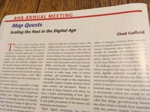
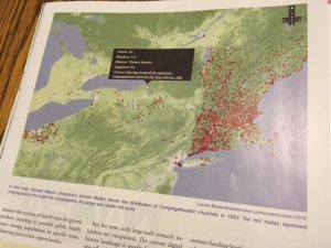
Once again, the timing of HIST680 is impeccable. I had just finished reviewing CartoDB when I went to my mailbox and pulled out this month’s Perspectives published by the AHA. The topic of one of the feature articles? You guessed it: digital mapping.

img_3398

img_3397

This simply reinforces my belief that taking this course and participating in the DH Certificate Program through GMU was not only a good decision, but a great one. Now onto my review….

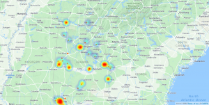
heat_alabama_interviews_cartodb_1_by_mepethel_10_23_2016_10_16_35

CartoDB (created by Vizzuality) is an open-source, online, cloud-based software system that is sure to please anyone seeking to visualize and store data using geospatial mapping. Basic usage is free with an account; however, better and expanded options are available with a paid subscription. The company also provides support and custom mapping for an additional fee. The free account is accompanied by 50mb of storage, and data can be collected and directly uploaded from the web and accessed via desktop, laptop, tablet, or smart phone. Part of what makes CartoDB so intuitive is its user-friendly interface. Users can upload files with a simple URL cut/paste or file drag/drop. The program also accepts many geospatial formats, such as excel, text files, GPX, and other types of shapefiles, making CartoDB useful for humanities and STEM-related disciplines alike.  Once multiple data layers are uploaded users can create a visualization and manipulate this visualization through several modes: heat, cluster, torque, bubble, simple, and others. Once the visualizations have been organized and customized, CartoDB also provides convenient options to provide links and embed codes to share the map. Finally, CartoDB does a great job answering questions with online tutorials, FAQs, and “tips and tricks.” Google maps first ventured into web-based mapping tools, but CartoDB takes it to a whole new level.

Our activity involved using data from the WPA Slave Narratives, and it was a great hands-on exercise to discern the types of information and conclusions that can be drawn by viewing information geospatially. By visualizing the location of interviews it works much like Photogrammar (Module 8), which allows users (teachers and students alike) to see several patterns: travel, chronological, and the geographical concentration of interviews in particular areas of Alabama.

While our class activity provided the data, I am anxious to experiment with data that I have collected myself. For example, I am working on images and maps for a recent manuscript, I have the addresses for several colleges and universities in Nashville. I received an email last week from the press that said they were unable to take my historical maps and provided layered data which would show the relationship between the location of institutions of higher education and the geographical trends of urban growth in Nashville from 1865 to 1930. I look forward to using CartoDB in the future.


Categories
Uncategorized

Voyant Reflection

This module about data and text mining and analysis is not only relevant but timely.  Just yesterday as I was working with Voyant and exploring data projects such as “Robots Reading Vogue,” I saw this in my news feed. This Bloomberg article provides a visual representation of this year’s presidential debate with word analyses based on big data:
http://www.bloomberg.com/politics/articles/2016-10-19/what-debate-transcripts-reveal-about-trump-and-clinton-s-final-war-of-words?bpolANews=true


I think Voyant is one of the coolest and most useful tools I’ve ever used. That said, the web-version is very glitchy. Attempting to get key words to show for different states and to export the correct link that matched the correct visual took over four hours. Also if I stepped away from my computer for any length of time, I had to start over with stop words, filters, etc. In order to get the desired export visual links, I found it easier to reload individual documents (for states) into Voyant, and I hope the activity links I entered do in fact represent the differentiation I was seeking as I followed the activity directions. I would not use this with my students until I could work out the kinks and had fully tested the documents to be used in class. As an educator, I know all too well from experience that if something can go wrong with software or web-based applications when working with students, it usually does. That said, I have downloaded a version of it to my computer and hope this will make Voyant more user-friendly and maximize utility for data analysis.

Despite technical difficulties, this tool (Voyant) allows users to mine and assess enormous amounts of data in many different ways. To have such a tool is an incredible gift for both teachers and students. You can visualize word usage with word clouds, links to other words, graphically chart the use of key words across a corpus or within a document, view and connect word use within context and within a range from 10 words to full-text.

New users should:

  1. Open http://voyant-tools.org/
  2. Paste url text or upload document and generate text data
  3. Manipulate “stop words” to appropriately cull key words
  4. Compare/contrast key words in different documents as well as across the entire corpus
  5. Study and analyze key words using word cirrus, trends, reader, summary, and contexts
  6. Draw conclusions

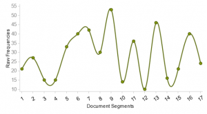
Trends: Frequency of “Mother” in Georgia WPA Slave Narratives
index_ga

Trends: Frequency of “Mother” in North Carolina WPA Slave Narratives

css.php