Categories
Uncategorized

WORDPRESS: DIGITAL TOOL REVIEW

Vada Sells is a student of Digital Humanities at Belmont University.

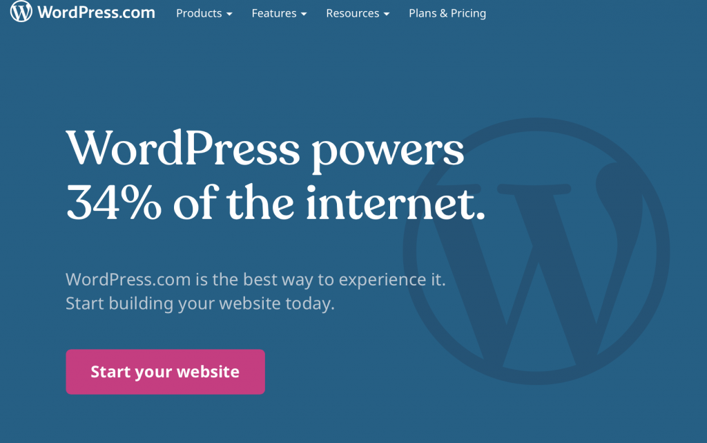
WordPress is a platform that allows anyone to make a website for free. It makes website building simple and accessible to people without coding skills. It began in 2003 and has since built a massive community of users ranging from individual bloggers to big businesses that use it to power their websites. In fact, as many as 34% of websites on the internet were created with WordPress. This tool originally aimed at allowing people to create blogs, but now offers service in creating other types of websites such as business websites, ecommerce websites, membership websites, etc. Users can create essentially any site they want.

Because wordpress offers a massive variety of services, navigation is not simple. In order to create even a simple blog website, many steps are required. In creating a website, users can either choose a template wordpress offers or code their own websites. Users must also choose between using wordpress.org as a platform as opposed to wordpress.com. If a user intends to  “host” the website, he or she will use wordpress.org. This process involves using your own software, buying a domain, and managing your own server. WordPress.com doesn’t require any backend code. A website made with wordpress.com will appear as www.yourwebsitename.wordpress.com  because wordpress is hosting, but a website made with wordpress.org will read as www.yourwebsitename.com.

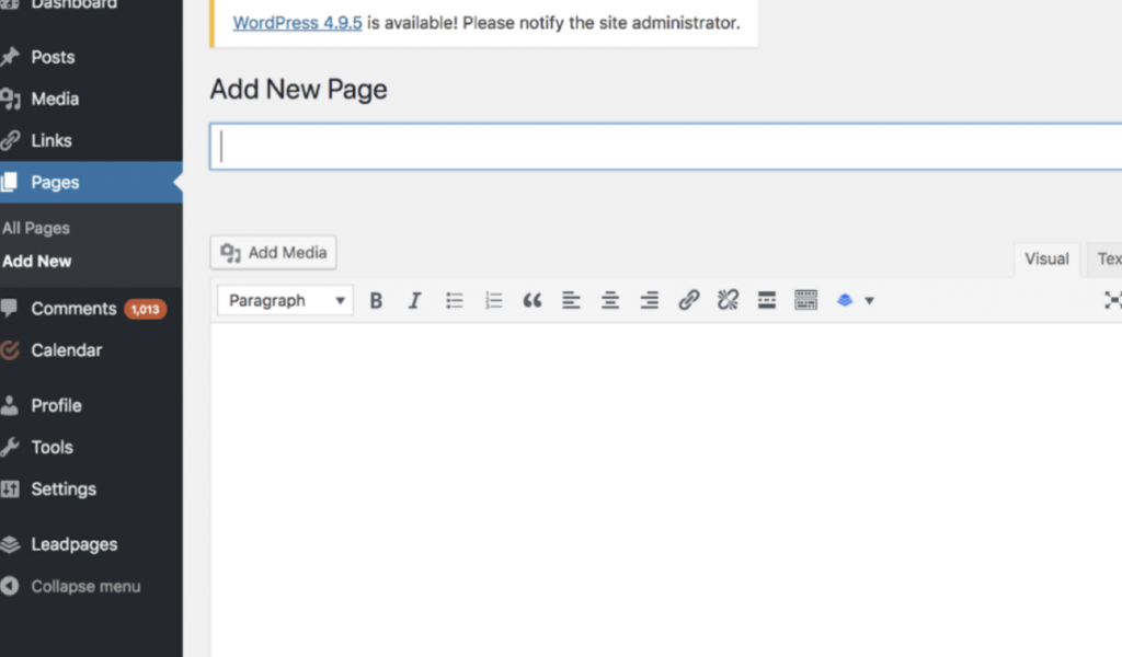
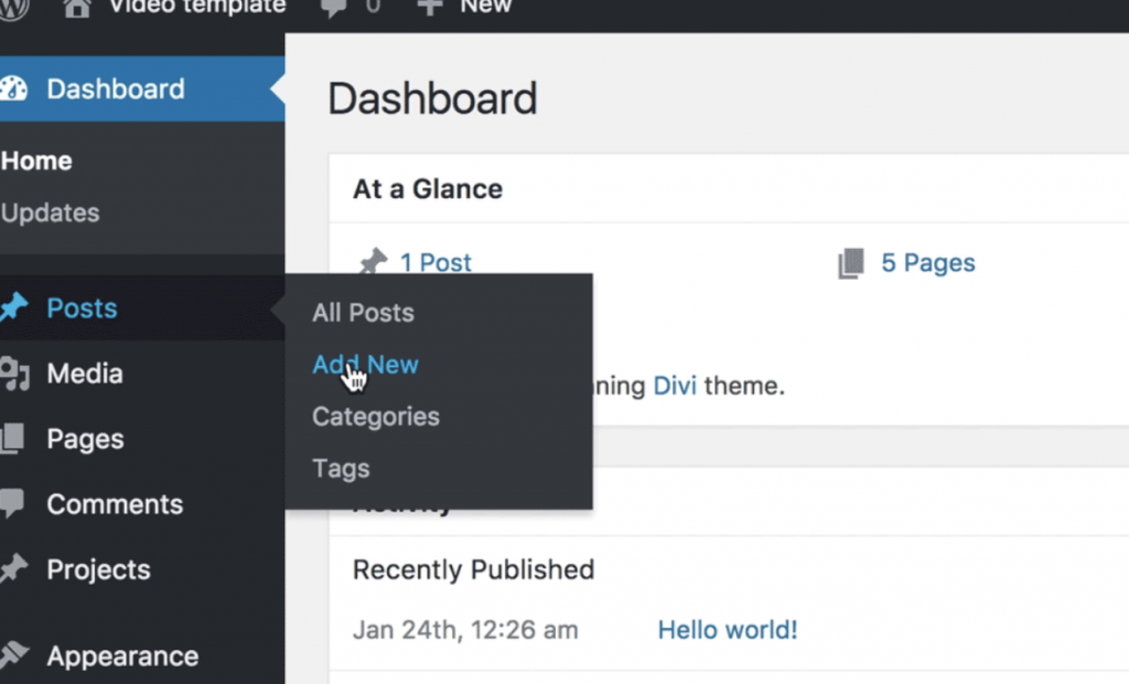
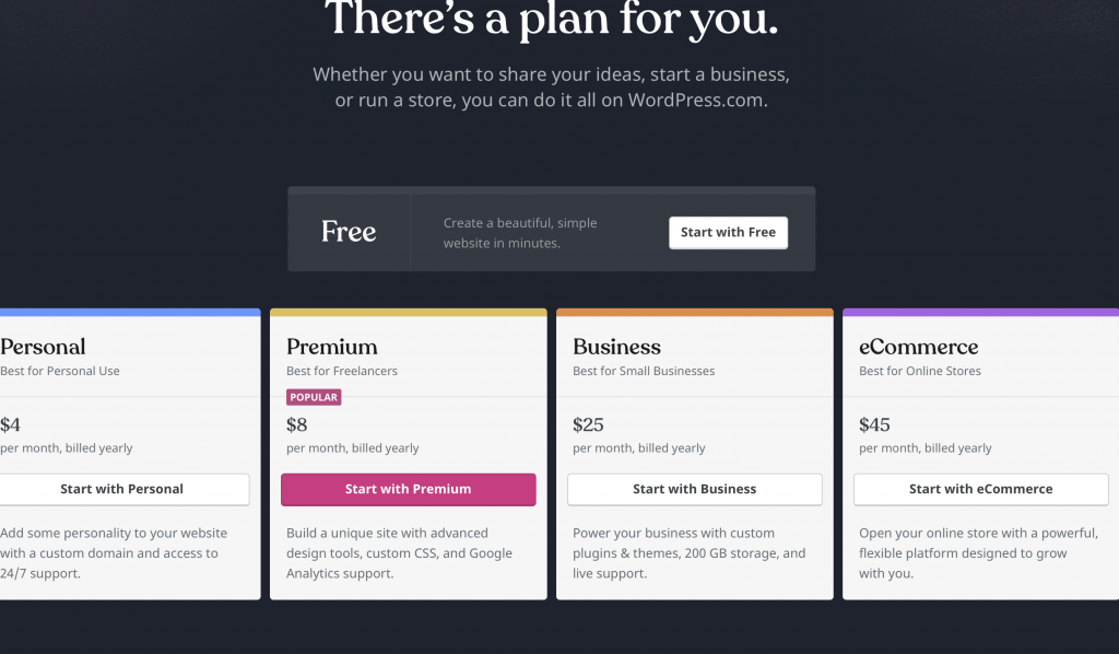
To create a website with wordpress.com, users begin by selecting a plan that is most ideal for their intentions of the site. Different plans offer features most ideal for bloggers, business owners, etc. After picking a plan, the next step is to select a domain name. Once the user has selected a domain name, he or she is free to select a template for the website and begin adding content. Wordpress offers many different templates to display content for consumers. Users can navigate the dashboard to add posts, media, links to more pages, and additional features. They can also use the dashboard to edit the style and layout of the page to best represent their content and intention for the site. To add a new page to the website, the user must click on the link “page” and simply add a title, link and content. Content can be videos, photos, or just text. All added work is private until the user hits “publish.”

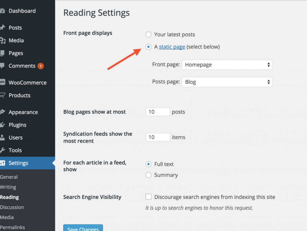
The “settings” tab in a wordpress site offers customization options. Users can choose between having a static or dynamic page, which allows content to move around the page. Another useful tool for customizing a wordpress site is the addition of a plug-in. A plug-in is a type of software that offers additional features not offered in wordpress alone. This allows for further customization as website designers can cater to other users such as members, commenters, or customers by enabling features like direct messaging or anti-spam methods.

WordPress is a platform that can be as simple or as complex as the user intends. There are so many resources on the internet that walk users through the basics of designing a wordpress site. The universality of wordpress makes it a great resource for beginners and experts alike.

How to use:

  • The next step is choosing a plan that makes the most sense for your website’s purpose.
  • After this, users will choose a domain name and begin customizing their sites.
  • Customization with the dashboard
  • Users can add additional pages to the site
  • Users can customize by adding content and photos
Categories
Uncategorized

StoryMap Arc-gis: Digital Tool Review

StoryMap is basically a website building tool that focuses on building a site to help tell a particular story. It allows user to add interactive media, specifically maps, to help advance their story and visualize the information. It’s a fun way to illustrate a story that would typically be told through plain text.

StoryMap is best used on stories that involve location. The map feature is extensive and allows users  to create custom maps with many different points, line, and even images to illustrate their journey. It is easily added to the site itself and very user friendly. I figured it out within minutes, and I’m not a mapping expert at all. I would use StoryMap for it’s mapping feature alone. It’s much easier to use than advanced GIS mapping systems and great when you just want a quick easy map.

I found the website generally easy to use, so easy that I’m worried I may be missing the point. Adding content is as quick as pressing the plus button and I like the fact that the content layout is already done for you. For some people it might be frustrating to not be able to move things just where you’d like them, but for someone who doesn’t like graphic design: it’s perfect.

On that note, however, I do wish there were more options to customize your site without paying for a subscription.  I would have liked to have been able to change my background color. There are only 4 options in the free version: white, cream, green, and blue. Honestly, I want more.

            In my opinion, this is a very cool way to visualize a story for a presentation or class. It definitely achieves what it was going for which is a program to visualize story content. However, I don’t really see myself using it in the future. I’d rather tell a story orally than try to display it with graphics. But if it comes down to just text or this, this definitely wins.

How To:

  • Go to StoryMap’s website:   https://storymaps.arcgis.com
  • Create an ArcGIS Public Account
  • Start a story
  • Title your story
  • Add content: options for paragraphs, headings, maps, images
  • When adding maps place points from the tool bar to help advance your story
  • Publish your story from the button in the top right!

Here’s my example:

Categories
Uncategorized

VR Scene: Digital Tool Review

Aidan McKernan is a student in Digital Humanities at Belmont University.

Scene VR is an easy-to-use online program that allows users to create their own VR scenes using panoramas or 360 degree photographs, all online. It also encourages users to tell stories about what their VR scene might be about; for example, one of the scenes on the homepage is a 360 degree photo of wreckage after Hurricane Katrina. The project is hosted by Knight Lab. It can be found by typing ‘Scene VR’ into an online search engine.

On the homepage of the site, users are greeted with examples of scenes that other users have made using the tool, along with an inviting green button that says, “Make a Scene”. Everything needed to create one’s own scene is all on the same page, with all of the links in the top right leading to other projects hosted by Knight Lab. The homepage also has a brief description of the tool, frequently asked questions, a privacy disclosure, and a link to GitHub for those who want the technical documentation of the tool.

The tool is incredibly straightforward and easy to use. All one has to do in order to create their own VR Scene is upload a panoramic picture and title it. Then anyone is able to explore the scene in their own desktop. Because the project is entirely hosted online, it allows users to view scenes on multiple devices, including desktops, laptops, and mobile phones. VR Scenes can also be viewed on popular VR headsets.

How to Use:

  • Find Scene VR through your search engine of choice (Chrome and Firefox browsers work best), or use this hyperlink: https://scene.knightlab.com
  • Click the “Make a Scene” button on the homepage.
  • Click the “New Project” button at the bottom of the page.
  • Title and describe the project by entering information into the fields at the top of the page. Then, click the “Add Photo” button at the bottom of the page. Browse your computer files for the photo you want to upload.
  • Click the share button in the top right corner.
  • Use the “Preview” button to preview your work or use the social media links to upload your scene.You can also embed the provided link onto a website.
Categories
Uncategorized

Voyant: Digital Tool Review

Alexandra Hayden is a student in Digital Humanities at Belmont University.

Voyant is an open-source, web-based digital tool that performs text analysis, statistical analysis, and data mining for digital texts. Open-source is a type of software where the copyright holder releases the source code under a license, granting users the right to view, edit, and distribute the software to anyone for any purpose. Data mining is a method of examining extensive databases to produce new information. The primary use of Voyant Tools is to help analyze and interpret scholarly texts to provide a means of deeper understanding through pattern recognition, word frequency, frequency distribution plots, and KWIC (key word in content) displays. Voyant can examine anywhere from small passages that are directly typed by the user into the search tool to massive bodies of work submitted using an external URL (think a Shakespear text online).

Steps:

1) Upon landing on the home page, users will see a text box that prompts you to type, open, or upload your text. I am using Shakespeare’s All’s Well That Ends Well from an online source. The whole text is listed on one page. Upload or paste text/URL and click reveal. http://shakespeare.mit.edu/allswell/full.html

2) After clicking “Reveal,” you will land on the below page.  From here, you are able to explore all the functions Voyant offers.  So, click around to explore!

Main Tools offered:

*Note: all tools can be exported with a separate URL

Cirrus: shows the number of times a word occurs in the text in a word cloud format

Terms: shows the number of times a word occurs in the text in a list format

Reader: shows the full body of text – hover over a word to see how many times it is listed in the text.  If you click on a word, it will highlight it whenever it appears in the text.

TermBerry: mixes visualization with high frequency – hover over a circle to see how many times it is used in the text; this bubble will highlight in green. The bubbles that highlight in pink will give you a co-occurrence number, or how many times they appear in proximity to the green bubble.

Trends: shows the relative frequency of a word in each segment (how many times a word occurs in comparison to the total number of words in the segment)

TermRadio: examine word occurrence over a corpus spanning a period of time

Bubblelines: The text is represented as a horizontal line which is divided into equal segments.  Each word is a bubble; the size of the bubble shows the word’s frequency in the specific segment of the text.  The bigger the bubble, the more a word appears.

Summary: a textual overview of the test including number of words, number of unique words, shortest and longest documents, lowest and highest vocab density, average number of words per sentence, most frequency words, notable peaks in frequency, and distinctive words

Phrases: shows the number of times a phrases is repeated in the text (count)

More info about tools: https://voyant-tools.org/docs/#!/guide/tools

Review: Overall, I think Voyant is a wonderful tool to help focus your understanding and study of a text.  I especially feel Voyant is good for plays and novels where storylines are followed as you are able to use statistical analysis to see where characters and events occur throughout the book.

Categories
Uncategorized

Timemapper: Digital Tool Review

Rachel Phan is a Digital Humanities student at Belmont University.

TimeMapper is a program through Open Knowledge Foundation Labs that allows you to upload spreadsheets to visualize data with timelines and maps. There are a couple of options available on the creation page. You can upload spreadsheets anonymously or with an account. The downside to having an account is that you can only sign in through Twitter, so you would have to create a Twitter account to save and be credited for spreadsheets.

It is really simple to create a TimeMap with their pre-prepared examples because it simply involves them putting in an example spreadsheet URL. From there you can select the title, type of data view, the dating system, and from which event to start.

The TimeMap view is a little confusing and overwhelming at first view because all of the information is presented in one screen. The picture and explanatory text take the biggest chunk of the screen with the scrollable timeline underneath. The map feature is relegated to a small space in the left side. As far as I know, you can’t make any section bigger or smaller, only condense the size of the information in the space. The timeline feature is nice because it shows the dates, and you can scroll based on date or click based on event. The map section is flawed because the points are cluttered in a centralized location but are unable to be fully seen in the small map if they’re spread out. The timeline view is the same as the plain timeline. The map view, while bigger, offers no information on the points being clicked besides the event title. Also, if you zoom out too much, multiple copies of the earth map are laid side-by-side. Overall, the map feature isn’t really well-thought out.

There isn’t anything to the backend because it just simply involves uploading a spreadsheet that’s formatted for the program to use. The tutorial only showed how to upload an existing spreadsheet from Google into the program, and it took me going to the FAQ to find out some info about how to create the actual spreadsheet. The info is very minimal, which makes it harder for someone who hasn’t made a spreadsheet specifically for the program to use.

I created my own simple TimeMap to test the features. I had to continually refer to the tutorial to see how his spreadsheet was formatted to figure out mine because there were no other instructions. Once that was figured, however, I uploaded it, and it worked. There’s no way to customize the map’s looks beyond the type of presentation, but the program is able to take the data and create a TimeMap in seconds, which I found impressive.

There is value to the student because most timelines are educational and provide a way to visualize data in the context of history, but the way information is presented is overwhelming. The timeline itself is fine, but any version of presenting information including the map is either crowded with all the information or lacking with just the map. Besides the timeline, the information presentation is just unappealing. There also aren’t any features to customize the TimeMaps to make them unique, which I found would make for boring presentations. Overall, it’s simple to use once you known how to make the spreadsheet and is a good tool for visualizing data.

How to use:

  1. Create a spreadsheet in Google Drive with the headings “Title,” “Start Date,” “End Date,” “Description,” “Image,” “Place,” and “Location.”
  2. Fill in the sheet with the corresponding items under each label. (Note: the dates can be in US or non-US style, but you would have to select that before publishing. Location can be either latitude-longitude coordinates or GeoJSON objects)
  • Publish the spreadsheet to the web and then click share to get the URL
  • Paste the URL into the data source area when you go to visualize the data.
  • Enter a slug for the TimeMap.
  • Customize by selecting the type of visualization, the type of dating (US vs non-US), and which event to start from.
  • Click publish. You’re done!

My example: http://timemapper.okfnlabs.org/c5f634fe296f47c/raphael-timemapper-sample

Categories
Uncategorized

Thinglink: Digital tool review


Sam Bartholomew is a student in Digital Humanities at Belmont University. 

Thinglink is an online workspace that allows you to annotate and tag photos and videos for presentation online. The user can add image and text, link other wesbites within an image or video, and use a collection of annotated files to create a virtual tour. The images and videos can either be standard rectilinear image or video or an equirectangular (360) image or video which allows a user to pan around a scene with the ability to place tags on any location within the image.

The interface itself is intuitive and very easy to figure out without any tutorials. An account is required and features are limited for free users. The software is not cheap for the professional user with yearly memberships costing around $600 dollars. In order to publish any images or videos the user has annotated, the user must pay for an upgraded account. A user can explore other creator’s work, provided they have made it public.

The most common and practical use of the interface is for e-learning and design purposes. For instance, a science teacher could annotate a drawing of the layers of the earth showing the ocean and crust sections and make notes within the image for the students to explore. An interior designer could mark up an overhead view of a home for the client to view notes about different spaces and pieces within the design. An urban planner could mark key elements in a plan for a neighborhood of the city for a city council and general population to explore and ask questions about the image and its notes.

There are limitations for sizes of images, and there are specific requirements for the aspect ratio and pixel dimensions for equirectangular uploads or the interface with show an error and cancel the upload.

How to Use:

  1. Google “Thinglink” or go to www.thinglink.com.
  2. Click “Log In” in the menu bar to sign in or tpcreate a new account. (You can use a Google or similar account if that’s your preference.)

3. Click “Create” to make a new project and select the format of your desired upload.

4. Once the editor opens, click add tag to start annotating the project.

5. Add as many tags as needed/wanted and click “Save & Close” when you’re ready.

6. You can now preview your project and have the option of publishing it if your account allows it.

Categories
Uncategorized

SoundCite: Digital Tool Review

Soren Allen is a Digital Humanities student at Belmont University

SoundCite is a program which generates inline audio for webpages. SoundCite aims to seamlessly incorporate audio into web design, allowing readers to read and listen to audio, not needing to stop reading to listen. The text that the audio corresponds to is put into a gray box with a play button that you can click while reading. The audio plays over the text while you read, and the playback controls are inside the body of text, not somewhere off to the side of the screen.

The audio here can be used for a multitude of reasons, including emphasizing spoken words, background noise for an event of some kind, or music that is incorporated into the story. The website shows numerous examples of news articles and other webpages that have used SoundCite for extra effect with their audio. SoundCite uses a variety of audio files to allow for versatile use of the program. It is extremely simple to use:

  1. Publish an audio file to the web, and insert the URL into SoundCite (if you don’t have an audio file but want to try it out, the Gigue from J.S. Bach’s Cello Suite No. 2 in D Minor is available as a sample audio file).
  2. If you do not want your entire file to play, you may enter start and stop times for the audio file. You can sample the section of the file before you finalize it.
  3. Paste the embedded code that SoundCite gives you at the top of your page and wherever you want the audio in line with your text.

SoundCite can be used for a variety of projects, and it is extremely quick and easy to use with any webpage, and it also functions on mobile devices. SoundCite is available as a WordPress plug-in.

Categories
Uncategorized

Juxtapose: Digital Tool Review

Sydney Whitton is a student in Digital Humanities at Belmont University.

Introducing: Juxtapose, a digital tool that allows stories to be compared. Taking two pieces of similar media (photos, GIFs), this program highlights “then/now stories that explain slow changes over time”. It also demonstrates “before/after stories that show the impact of single dramatic events”. This tool has been used to compare stories such as; Floyd Mayweather in 1998 to 2015, tornado damage in Washington, IL, and flood damage in Texas. This tool is also utilized by many photographers to demonstrate before/after views when advertising their presets for editing photos.

How to Use:

Juxtapose is a great tool for anyone telling a story with two parts- the before and after. This is an easy to use program that only requires two similar files that can be placed next to one another.  To start, once visiting https://juxtapose.knightlab.com, is uploading the two files into their designated place, as featured below. After adding the required information, such as the year and source, you can select what information you’d like to be public on the slider. You can also chose the starting slider position and the orientation (vertical/horizontal). You have the option to preview your slide and then to publish it after viewing.                    

I ran into a few issues with this tool. The function of putting in the required information is simple, although I was unable to preview my creation and unable to publish due to this. I suspect that is due to my version of flash player or plug-ins.

Categories
Uncategorized

Omeka: Digital Tool Review

Sara Scannell is a student in Digital Humanities at Belmont University.

Omeka is a valuable resource for anyone interested in digital humanities — both in terms of creation and consumption. The web-publishing platform allows users to create sites that can display collections, create virtual archives and exhibits, make teaching websites, and more. Creating a free site is fairly easy. To begin, a user will upload their gallery or other digital content. The content will be categorized using the Dublin Core system to universalize the site’s metadata. Once all the content is uploaded, putting all the pieces together into a site is also pretty simple. Creating a gallery or exhibit is as easy as clicking and dragging images into the right place. Users can tag different language in their text so that visitors can more easily find what they are looking for. Conveniently, it is also compatible with other sites like YouTube so that users can use multiple mediums on their projects. For site aesthetics, a number of attractive themes are provided. The rest of the site can be modified through a vast number of plugins that do everything from connecting social media to importing CSV data files. In order to give creators full control of their site, Omeka also includes a feature that allows people to give different levels of permissions to different contributors. This is valuable because it can allow for the public to contribute, but prevents the rogue, sometimes unfiltered and incorrect contributions that can dominate sites like Wikipedia. The Omeka forums are a great resource for users with questions, as a number of more experienced users share their expertise regularly. Interestingly, many significant digital humanities projects, like Bracero, use Omeka as a basis for their site. But it is also being used by librarians, archivists, museum curators, teachers and many others. Omeka.org is free and open source for all, although it has some limited functions and is more difficult to make changes to. Omeka.net has the same function but requires the purchase of a plan, with pricing ranging from $35 a year to $1,000 a year.

This video provides a valuable overview if you would like more information.


Categories
Uncategorized

Soundcite: Digital tool review

Riley Wymer is a student in Digital Humanities at Belmont University.

SoundCite directly links brief audio clips embedded in text that a user can choose, edit, and apply to their website. SoundCite recommends using only a couple seconds from clips, applying this clip sparingly but effectively, and utilizing different parts from the same audio clip to the text.

This site can be accessed by an user and is not limited to scholarly use. You simply copy the link to the audio URL and load it into SoundCite. Then, you select your start and end time as well as the number of plays and what text to which you’d like to link the sound. Soundcite then outputs an embed code that can be pasted where the text would normally go on your webpage. This cannot be used for a simple Microsoft Word doc or PDF.

SoundCite was generated by KnightLab from Northwestern University by their School of Engineering and MEDILL. KnightLab describes themselves as “a team of technologists and journalists working at advancing news media innovation through exploration and experimentation.”

The benefit of SoundCite is that the audio is not isolated media that is linked to or opened separately, but in fact embedded in the text. SoundCite suggests using their technology for essays on music (pulling in the song of discussion), spoken word (incorporating sound effects), or news articles (building environments relating to the topic).

A major drawback to SoundCite is the requirement to include an audio URL rather than a link to a video with audio in which SoundCite could easily strip away the video or even link to a file on your personal computer. SoundCloud has imposed rate limits on usage and will deactivate SoundCloud clips upon overuse; however, SoundCite offers a solution by registering for a SoundCloud API key. This becomes even more frustrating when considering in order to get around the audio URL issue, most people will turn to SoundCloud to upload their audio clips and assign them a URL. SoundCite even admits its users should avoid SoundCloud despite no other “novice-friendly audio hosting services” being available. Google Drive and DropBox will not work either. Their go-around has been to upload media onto WordPress and use that URL.

Steps:

  1. Find an audio clip online you would like to link to text. If the audio does not have a URL already: create a SoundCloud account and upload the audio there.
  2. Copy the audio URL and head to soundcite.knightlab.com
  3. Click the green “Make a Clip” button
  4. Paste the URL into SoundCite’s Step 1
  5. Scroll down and set the clip options to adjust start and end times as well as number of plays and text to link
  6. Scroll down and copy the embed code from SoundCite’s Step 3
  7. Paste the embed code into your website in place of the text to which audio will be linked
  8. If your link deactivates you will need to sign up for a SoundCloud API Key by following the steps listed on SoundCite’s “Attention” blurb
css.php