Categories
Uncategorized

Whose Public? Whose History? What is the Goal of Public History?

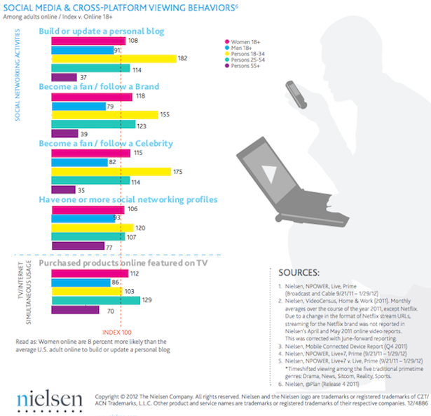
Ron Grele poses three important questions in “Whose Public? Whose History? What is the Goal of Public History?”  While this article, written in 1981, does not address the digital methods that have changed the look, feel, and reach of Public History–it is worth noting that the basic purpose and audiences have remained the same.

The question of “Whose Public?” aims at defining audience. I believe my role as an archivist and author is connected to several audiences: those engaged in the southern history, urban development, and higher education; undergraduate students at Belmont; student and alumni at Harpeth Hall; and local historians and preservationists. The digital element connected to Public History is now more important than ever.

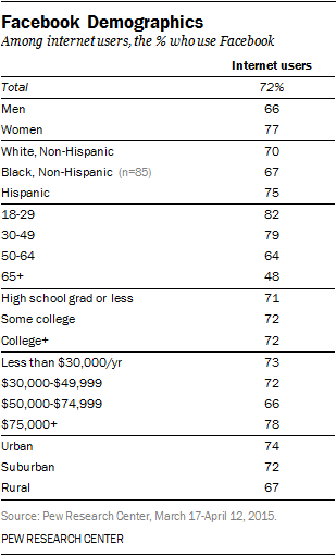
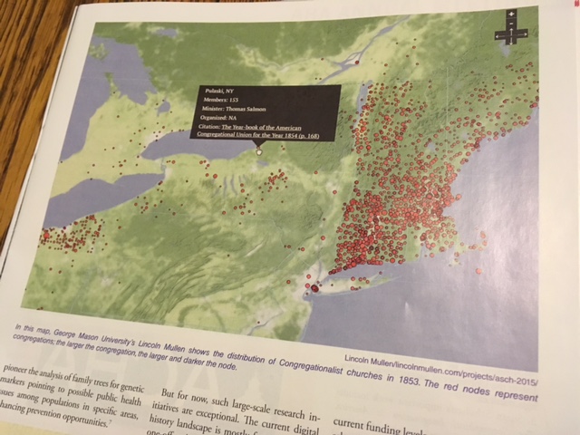
The question of “Whose History?” addresses interpretation, intended audience, and sponsoring institution. For example, in Nashville, an exhibit curated by the non-profit Country Music Hall of Fame will be very different from a “War Memorial Auditorium” exhibit curated by the Tennessee State Library and Museum (state govt). And an a new exhibit installed at Ryman Auditorium, part of the for-profit company Gaylord Entertainment, provides even greater contrast with the first two examples. All three share common elements such as bolstering the historic image of Nashville, showcasing the city’s music industry, and celebrating the important role of the Grand Ole Opry. But to answer “Whose History?” and how that history is portrayed is clouded by an institutions dependence on tax dollars (or tax exemptions), the ability (or legality) to fundraise, and how the cost-benefit value is measured (i.e. profit, attendance, school groups, etc.). In an article entitled “A Picture of Public History,” published by the AHA in 2009, a survey reflects the wide-ranging nature of the field:

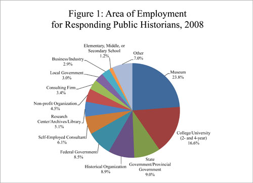
To answer the question of “What is the Goal of Public History?” is a broad question, one that has caused more disagreement than agreement within academia. John Dichtl and Robert B. Townsend surveyed nearly 3,000 professionals in history-related fields. One respondent commented, “A historian is a historian whether working in government, academia, or private industry.” Denise Meringolo suggests that public historians are a unique breed, perhaps the “little sister” of academic history with a different set of tools and intended outcomes.  For me, the goal of Public History remains three-fold: to engage, educate, and disseminate history to the general public, to students and colleagues, and to the local community. Despite differences of opinion in regard to the scope and purpose of Public History (in our module readings), this simplistic statement drives my basic understanding of the field which, in turn, fuels my interest in Digital Public History.

Sources:

John Dichtl and Robert B. Townsen, “A Picture of Public History: Preliminary Results from the 2008 Survey of Public History Professionals,” Perspectives in American History (September 2009). The article is available online at https://www.historians.org/publications-and-directories/perspectives-on-history/september-2009/a-picture-of-public-history.

Lawrence B. de Graaf et al, Survey of the Historical Profession: Public Historians, 1980–81 (Washington, D.C.: American Historical Association, 1981). The report is available online at http://www.historians.org/info/SurveyofProfession_Public_80_81.pdf.

Ronald Grele “Whose Public? Whose History? What is the Goal of Public History?” The Public Historian 3.1 (Winter 1981): 40-48.

Denise D. Meringolo, Museums, Monuments, and National Parks: Toward a New Genealogy of Public History (Amherst: University of Massachusetts Press, 2012).

Categories
Uncategorized

Digital Public History Introduction

Hello HIST694! I am excited for this course and post this entry as an introduction. Interestingly, I was recently asked to update my biography for Belmont University, where I serve as an adjunct professor. Here is an excerpt that provides some background information about my professional work and interests.

___________________________________________________________________________

Author, scholar, and educator Mary Ellen Pethel received her BA from the University of Tennessee, MEd from Berry College, and PhD from George State University. A lifelong learner, Dr. Pethel is completing a post-graduate certificate in Digital Humanities through George Mason University. At Belmont University she teaches in the Honors Program as well as Global Leadership Studies including interdisciplinary courses such as “The Age of Exploration,” “Making the Modern American City,” “Global Cities and Urban Spaces,” and “Introduction to Global Leadership.”

In addition, she is a teaching faculty member and the school archivist at the Harpeth Hall School, which celebrates a shared history with Belmont University from 1913 to 1951 as Ward-Belmont. This shared history was part of a recent book, Girls Education from Ward Seminary to Harpeth Hall, 1865 to 2015. Dr. Pethel’s newest book expands on the scope and sequence of higher education and the role of higher education in urban development. Athens of the New South: College Life and the Making of Modern Nashville, published in 2017 by the University of Tennessee Press.

___________________________________________________________________________

Digital Humanities is a still a relatively new field, not available when I was completing my PhD coursework, but the DH have always been of interest to me. It is for this reason that I remain grateful for the post-grad opportunity to gain meaningful training and experience through GMU and the RRCHNM. Meanwhile, my interest in Public History has long played a role in my educational and professional career. My goal for this semester is simple: to continue the work and experiential learning that began with HIST680. Let the work begin.

Categories
Uncategorized

Final Project and Feedback

My project webpage can be accessed from this page (tab top right labeled “Nashville”) or directly via: http://drpethel.com/nashville/

My project goal encompasses a practical and educational aim using digital tools. I am creating a course portfolio with a thematic focus of “Making Modern Nashville.” I have taught a special topics upper-level course for Belmont University for the past two years entitled: Making the Modern City. In the course we trace urban history and development and place it within the larger economic and cultural context of American history. The last part of the semester students examined Nashville as an urban case study and produced a culminating work based on original research, primary, and secondary sources. My project seeks to build a Omeka collection and exhibit based on their research. I chose this focus because I wanted to apply tools and methods associated with digital humanities with courses I currently teach. Further, I wanted to create something that could be beneficial to multiple audiences while also showcasing student research that deserves digital and more public platform.

I chose to use Omeka because it fits the purpose of my digital and educational goals because I can create collections, exhibits, and special features that will allow me to add, layer, and reorganize from one semester to the next. In other words, there is no finished product but rather an ongoing project that can continue to grow to showcase digital-born student research and work that is valuable to scholars, the university, and the local community.

Before this course I had Omeka account and had established a site, but it was really for experimental purposes. I have since migrated any information and data from the original site to my drpethel.com domain. Some of the formatting changed a bit with the migration, so it took some time to clean up, delete duplicates, upload new sources, and create metadata. I also had to determine the best possible way to set up collections and exhibits that were easy to navigate and engaging for the user. I discovered that aside from the overarching theme, “Making Modern Nashville” there were more connective sub-themes among the different projects than I had originally realized. This made my work both easier and harder as I wanted to feature all projects connected to my “Past, Present, and Future: Downtown Nashville” exhibit, but I didn’t want to create an exhibit that completely overshadowed other items and other collections. I also had to do quite a bit of editing to make sure I used common language via Dublin Core and also with tagging.

The feedback I received was helpful–particularly to read that both reviewers thought the idea and sources interesting and potentially useful as a student showcase but also a source of scholarly work that could help someone researching a similar topic in another city or Nashville itself.  Elaine mentioned the potential of this project to go beyond the university to involve crowdsourcing. While I think this is a very noble goal, I would need additional support or funding to be able to commit that kind of time to promote, build, and manage such a project. Even beyond this class I plan to continue to hone this site–adding more features, sources, and descriptive information in order to show its value as an academic and cultural home for special topics related to the metro Nashville area.

Categories
Uncategorized

Social Media Strategy

nielsen615

Social media is not just persuasive, it is pervasive in today’s world of constant online information, updates, and announcements. Moreover, growing numbers (particularly in the 18-34 demographic) get their news and information solely from mobile devices and many via social media platforms such as Facebook, Twitter, and Instagram. Social media is also useful because it is free, unlike television or print advertising.

The nature of my digital history final project is one that specifically targets a college-age demographic but also should (I hope) appeal to a larger audience interested in Nashville history, life, and culture. Thus my audience is three-fold: college students, scholars who specialize in southern history or urban studies, and residents of Davidson County.

My strategy aims to reach each of these groups through overlapping information using two social media platforms: Twitter and Facebook. Twitter will be used to generate interest, pose questions, and highlight parts of the digitized collection to drive internet traffic to my Omeka exhibit and related issues to Nashville’s in the news. Over 35% of all college students use Twitter, and in fact, I have already used it in classes that I teach. Facebook will be used to convey the same information but in greater detail.  In addition to a greater range of features, Facebook’s audience also spans a wider spectrum as evidenced by the chart below (source: Pew Center, 2015).

2015-08-19_social-media-update_07

There are specific and broad messages that will be conveyed to my three audiences via Twitter and Facebook. New additions to the collection, new exhibits, and student work can be announced and introduced via Twitter and Facebook. Any events connected to the collection such as a Semester Showcase of student projects connected to the the study of Nashville can also be promoted. It is my hope that as this project develops and work is uploaded (born digital), social media can be used enhance the historical value of the work and attract “followers” who might also have contributions to make. At this time, there are no specific actions that I want potential audiences to take other than to observe and learn from the unique studies presented by my students as they investigate Nashville’s public transportation system, present original research, and explore the city’s downtown landmarks. I suppose that the digital project could inspire audiences (outside of class) to follow the designed walking tour of downtown for themselves.

My strategy of using Twitter and Facebook can be measured by the using the SMART strategy rubric:

smart-goal-rubric-template

  1. Specific (Who?):
    Participants (students) and audiences (college students, faculty, and those interested in Nashville history)
  2. Measurable (What?)
    To monitor project site visits through stat tracker and base social media posts via interest shown
  3. Attainable (How?)
    To post to Facebook twice per month, and Twitter weekly
  4. Realistic (How, Why important?)
    Posting once per month via FB and Twitter weekly is realistic and will keep the digital project relevant. Student in current courses can also help to promote the site by tagging or liking my posts.
  5. Time-bound (When?)
    Over the next academic year (at a minimum)
Categories
Uncategorized

Crowdsourcing Reflection

When one thinks of the term crowdsourcing, practices related to business, marketing, and/or consumerism first come to mind. In academia, the idea of crowdsourcing seems most relevant to science disciplines or statistics. However, over the past few years the idea of crowdsourcing has been co-opted by the digital humanities.  In the digital humanities, the practice of crowdsourcing involves primary sources and an open call to the general public with an invitation to participate.

There are pros and cons to crowdsourcing DH-related projects. Certainly having the benefit of many people working on a common project that serves a greater good is a pro. In turn, the project gains more attention because of the traffic generated by people who feel invested and share the site with others. On the other hand, with many people participating there is more room for error and inconsistency. Another con is the supervision and site maintenance needed to answer contributor queries, correct errors, and manage a project that is constantly changing with new transcriptions and uploads.

The four projects analyzed for this module reflect a range of likely contributors, interfaces, and community building. For example, Trove, which crowdsources annotations and corrections to scanned newspaper text in the collections of the National Library of Australia, has around 75,000 users who have produced nearly 100 million lines of corrected text since 2008 (Source: Digital Humanities Network, University of Cambridge). Trove’s interface is user-friendly but the organization and number of sources are overwhelming.

contributing

A second project, the Papers of the War Department (PWD), uses MediaWiki and Scripto (open-source transcription tool), which work well and present a very finished and organized interface. PWD has over 45,000 documents and promotes the project as “a unique opportunity to capitalize on the energy and enthusiasm of users to improve the archive for everyone.” The PWD also calls its volunteers “Transcription Associates” which gives weight and credibility for their hard work.

Building Inspector is like a citywide scavenger hunt/game, and its interface is clean, clearly explains, engaging, and barrier to contribute are very minimal. In fact, it is designed for use on mobile devices and tablets. As stated on the project site: “[Once] information is organized and searchable [with the public’s help], we can ask new kinds of questions about history. It will allow our interfaces to drop pins accurately on digital maps when you search for a forgotten place. It will allow you to explore a city’s past on foot with your mobile device, ‘checking in’ to ghostly establishments. And it will allow us to link other historical documents to those places: archival records, old newspapers, business directories, photographs, restaurant menus, theater playbills etc., opening up new ways to research, learn, and discover the past.” Building Inspector has approximately 20 professionals on its staff connected either directly to the project or NYPL Labs.

Finally, Transcribe Bentham uses MediaWiki. It is sponsored by the University of London and funded by the European Commission Horizon 2020 Programme for Research and Innovation. It was previously funded by the Andrew W. Mellon Foundation and the Arts and Humanities Research Council. They also ask volunteers to encode their transcripts in Text Encoding Initiative (TEI)-compliant XML; TEI is a de-facto standard for encoding electronic texts. It requires a bit more tech savvy, and its audience is likely smaller—fans, students, or enthusiasts of Jeremy Bentham and his writings.  As a contributor, I worried about “getting it wrong,” especially with such important primary texts. Due to the sources’ handwriting, alternative spellings, unfamiliar vocabulary, and an older, more formal version of English made this a daunting task for me. An additional benefit of this project is the ability of contributors to create tags. In sum, Transcribe Bentham has 35,366 articles and 72,017 pages in total. There have been 193,098 edits so far, and the site is 45% complete. There are 37,183 registered users including 8 administrators.

As noted by digital humanists on HIST680 video summaries, the bulk of the work is actually done by a small group of highly committed volunteers who see their designated project as a job. Another group that regularly contributes is composed of undergraduate and graduate students working within a project like Transcribe Bentham as a part of their coursework. A final group of volunteers are those who are willing to share their specialized knowledge with these research, museum, literary, or cultural heritage projects.

Crowdsourcing is an amazing tool that can be used to create a sense of community as well as to create a large body of digitized, accessible text. I think one major factor to remember when considering successful crowdsourcing DH projects is the sheer scope of the work from several standpoints: informational, tech infrastructure, institutional, managerial, public value, and funding. Successful crowdsourcing methods applied to DH-related digitization and transcription projects requires a dedicated, knowledgeable, well-funded, interdisciplinary team based within an established institution, whether that be an educational institution or government agency. In other words, it is an enormous (and enormously admirable and useful) undertaking. But for now, I will simply have to admire academic crowdsourcing as an advocate and user.

Categories
Uncategorized

How to Read Wikipedia

fullsizerender

Wikipedia is no longer simply a open sourced encyclopedic reference. It is no longer just a website or a “thing,” it has also become a verb. If a person has a question or wants to know something, they are likely to “wikipedia it.”  When Wikipedia first emerged on the world (-wide-web) stage, educators and academics alike condemned it as non-academic and unreliable. However, today even these groups have, in part, reconciled with the notion of Wikipedia as a source of knowledge, reference, and a valuable tool for basic research.

At the same time it is more important than ever for teachers and students alike to understand the edit and content process and development of Wikipedia from behind the curtain. If users rely on Wikipedia as the first stop for information then essential questions should follow for responsible users: Who is creating the entry? Who is editing? What changes are being made, and why?

To answer these questions, users should go to the “History” tab to see a timeline of edits made and check the user profiles of those doing major edits. In addition links to page view statistics and revision history statistics (see media at top of blog post) can give a broader visual breakdown of edits and editors. This information can help the user to view editor profiles, assess their bias and credentials, the frequency of edits, and the general historiographical development of the entry. (I struggled with how best to use the “talk” tab.)

For example, with the Wikipedia entry for “Digital Humanities” reveals several interesting and important factors about its creation and development. The page began in 2006 as a definition with separate sections to explain DH objectives, lens, themes, and references. In 2007 and 2008 editors clearly believed DH to be focused on the computing aspect of DH project, with an entirely new section on Humanities Computing Projects (with three addition subsections). By 2012 the section headings seemed more settled, though expanded:

1 Objectives
2 Environments and tools
3 History
4 Organizations and Institutions
5 Criticism
6 See also
7 References
8 Bibliography
9 External links

The definition of DH also continued to shift, expand, contract–with many slight word changes that seemed to focus on the digital process and learning rather than the machine itself and programming. From 2014-2016 the open source, web-based nature of DH is clear and the discussion about DH as interdisciplinary and a transformative pedagogical development seems to be settled. The definition, application, and scope of DH continues to evolve. The basic organization of the page has remained although sections have been renamed, eliminated, split, and images have also been added.

Contributors and editors come from a wide range of persons connected to the Digital Humanities: librarians, professors, but also persons with no profile or title, like John Unsworth and Matilda Marie. There also appear to be institutional oversight and monitoring. In particular, there are several professors associated with the University of London such as Simon Mahoney and Gabriel Bodard, both of whom have profile and biographies attached.

Nearly 15% of all major edits are being made by digital humanists who have content specialization in the classics. There were also people more focused on computer science early on rather than academics focused on the humanities. The definition of “Digital Humanities” and particular phrases certainly generated the most controversy. That and the fact that the word “controversy” was actually added to one of the subheadings. It shows that DH and those who use it still struggle with defining its uses as well as the study of DH. What should a digital humanist be able to do, know, and to what end? These questions seem to drive issues that stir controversy.

This Wikipedia page reflects DH developments as a new area of intellectual inquiry, expression, and dissemination. But as a part of the larger theoretical exercise, analyzing this Wikipedia entry from the back end proved to be immensely eye opening. Not simply from the standpoint of understanding the “what” (its process and content evolution) but also deciphering the “who” behind Wikipedia. As author and software engineer David Auerbach states, “Wikipedia is a paradox and a miracle. . . . But beneath its reasonably serene surface, the website can be as ugly and bitter as 4chan and as mind-numbingly bureaucratic as a Kafka story. And it can be particularly unwelcoming to women.” As of 2013, women made up less than 10% of Wikipedia editors. As Ben Wright noted, “This disparity requires comment.” I would add that as digital humanists and educators, our awareness of this issue (and others such as the dominant Western-centric lens of Wikipedia) can be the first step in addressing these problems. We can also commit our efforts to being part of the solution.

Categories
Uncategorized

Visual Tools: Voyant, CartoDB, and Palladio

New web-based, open source technology has dramatically shifted the landscape of digital humanities. It has affected fields related to  digital humanities in two significant ways. For institutions and digital humanists a new quest to create, build, and host project sites has emerged. These digital projects allow users to interact and manipulate data in specific ways that yield almost infinite combinations. For users, these digital projects have laid the groundwork for moving research beyond the archive and to digest and draw conclusions based on datasets and information expressed through new macro-based visuals. The projects/programs reviewed here focus on textual analysis, geospatial mapping, and visual graphing based on large sets of metadata and archival information.

Voyant
Strength/Weakness: The strength of Voyant is the range of text analysis provided: cirrus, networks, graphs, context, verbal patterns. This is also its weakness. At first glance it’s very impressive but when trying to set or manipulate certain features available to the user for the purposes of customization or multiple datasets, the program does not function well.
Similarity/Difference: Voyant is similar to CartoDB and Palladio in that they are all free open-source, web-based programs. Voyant and Palladio do not require usernames or passwords. Voyant is different from CartoDB because CartoDB does require a sign-up. Voyant is different from Palladio because Voyant has one main screen with several visual fields, while Palladio only focuses on one type of visual analysis at a time, i.e. maps or graphs.
Complement: Voyant provides sophisticated text analysis and CartoDB provides sophisticated geographical analysis. Paired together, they provide unbelievably rich yet simple ways to “see” data relationships. Palladio and Voyant complement one another because they allow users to layer and filter the same data to produce different types of word graphs, clouds, and networks.

CartoDB
Strength/Weakness: The strength of CartoDB is the visual clarity and graphic options for its maps. The program’s weakness is that it really only serves to create maps and not graphs or other visual organizers. As a side note, this could just as easily be a strength because it does one thing well.
Similarity/Difference: CartoDB is similar to Palladio in that it focuses on one type of visualization, which it does very well. It is different in that its foci are  maps=CartoDB and graphs=Palladio. CartoDB is similar to Voyant on a basic level; they both produce visual graphic representations of the relationships within a large set of data. They are different because Voyant attempts to do many things (but not geospatial mapping), while CartoDB focuses on geography and not text.
Complement: CartoDB and Voyant complement each other well for the same reasons that they differ (above). Voyant does what CartoDB does not and vice versa, so together they provide an even more comprehensive picture of patterns that can be draw from data. Palladio and CartoDB complement one another because each does a different thing well. I would be tempted to use these two rather than Voyant because they are both user friendly.

Palladio
Strength/Weakness: The strength of Palladio is its relatively easy interface and the ability to drag and organize nodes and lines. The weakness of Palladio is the inability to save projects in formats other than svg or json, and that beyond the visual graphing network there is no additional information.
Similarity/Difference: It is similar to CartoDB in that it does have a map function, but Palladio is different because the most effective feature is visual network graphs. Palladio is similar to Voyant in that they both have word links and network features. They are different because Voyant is difficult to use (because of glitches not design), while Palladio is much easier to use.
Complement: Palladio complements Voyant by providing more options for word clouds and visual networks. Palladio provides a complement for CartoDB as they are both based on layering datasets manually with selecting different modes and filters.

As these open-source programs continued to “hone their skills” and “work out the kinks,”  they will no doubt provide continued and enhanced methods of data analysis that can be customized for and by individual interests.

Categories
Uncategorized

Palladio Reflection

screenshot-palladio-graph

Palladio is  a new web-based platform for the visualization of complex, multi-dimensional data created and maintained by the Research Lab at Stanford University called Humanities + Design.  As a side note, it looks like the lab has just produced another free digital tool, Breve: http://breve.designhumanities.org/.

Stanford is making big strides in the field of digital humanities, but more importantly free and web-based, in other words it does not required downloaded software or paid subscriptions, membership, etc. In many ways, Palladio is the first step toward opening data visualization to “any researcher” by making it possible to upload data and visualize within the browser “without any barriers.” There is no need to create an account and they do not store the data.  Palladio also offers several video tutorials are available an a sample dataset to try out.

1) New users should begin on the homepage where there is an inviting and obvious “Start” button. The next page allows the input of data using a drop method rather than the typical file upload.
2) Once the original data loads — a primary table is generated that breaks down the information by category (as listed in original metadata). From here the user can edit and add layers by clicking on the categories and uploading additional data sets.
3) After all data has been entered, users can go to map or graph in the top left hand corner depending on the type of desired visualization.
4) Palladio is not primarily intended for use as a geo-spatial service but it does provide some mapping which allows users to see the geographical distribution of data.
5) Perhaps its most impressive function is as a graphing tool that can be manipulated to show any given combinations of relationships using options found in the settings. The most important categories to consider are “Source” and “Targets” as this creates the base nodes (circles) and the connective data web.
6) There are additional filter and what Palladio calls “Facets” that allow the user to further filter/organize information based on sub-categories found within the data as well as a timeline function, which for our activity was not a factor.
7) Finally, when the graph is complete and organized as the user would like, there is a quick and easy download option to SVG format. It would seem that a jpeg option would also make the platform more user-friendly.

Unfortunately, in its quest and success as an open-source program, it limits the user in saving and/or sharing visualizations. For example, you can download json or svg but there is no sharable link or embed option (that I can tell). An embed code to add interactive graphs to this blog entry for example would have been great. Still, Palladio and other web-based, open-source, user-friendly programs such as this are going to be a gamechangers not only for digital history or digital humanities but for academic research, publication, and pedagogy on secondary, undergraduate, and graduate levels.

Categories
Uncategorized

CartoDB Reflection

Once again, the timing of HIST680 is impeccable. I had just finished reviewing CartoDB when I went to my mailbox and pulled out this month’s Perspectives published by the AHA. The topic of one of the feature articles? You guessed it: digital mapping.

img_3398

img_3397

This simply reinforces my belief that taking this course and participating in the DH Certificate Program through GMU was not only a good decision, but a great one. Now onto my review….

heat_alabama_interviews_cartodb_1_by_mepethel_10_23_2016_10_16_35

CartoDB (created by Vizzuality) is an open-source, online, cloud-based software system that is sure to please anyone seeking to visualize and store data using geospatial mapping. Basic usage is free with an account; however, better and expanded options are available with a paid subscription. The company also provides support and custom mapping for an additional fee. The free account is accompanied by 50mb of storage, and data can be collected and directly uploaded from the web and accessed via desktop, laptop, tablet, or smart phone. Part of what makes CartoDB so intuitive is its user-friendly interface. Users can upload files with a simple URL cut/paste or file drag/drop. The program also accepts many geospatial formats, such as excel, text files, GPX, and other types of shapefiles, making CartoDB useful for humanities and STEM-related disciplines alike.  Once multiple data layers are uploaded users can create a visualization and manipulate this visualization through several modes: heat, cluster, torque, bubble, simple, and others. Once the visualizations have been organized and customized, CartoDB also provides convenient options to provide links and embed codes to share the map. Finally, CartoDB does a great job answering questions with online tutorials, FAQs, and “tips and tricks.” Google maps first ventured into web-based mapping tools, but CartoDB takes it to a whole new level.

Our activity involved using data from the WPA Slave Narratives, and it was a great hands-on exercise to discern the types of information and conclusions that can be drawn by viewing information geospatially. By visualizing the location of interviews it works much like Photogrammar (Module 8), which allows users (teachers and students alike) to see several patterns: travel, chronological, and the geographical concentration of interviews in particular areas of Alabama.

While our class activity provided the data, I am anxious to experiment with data that I have collected myself. For example, I am working on images and maps for a recent manuscript, I have the addresses for several colleges and universities in Nashville. I received an email last week from the press that said they were unable to take my historical maps and provided layered data which would show the relationship between the location of institutions of higher education and the geographical trends of urban growth in Nashville from 1865 to 1930. I look forward to using CartoDB in the future.


Categories
Uncategorized

Voyant Reflection

This module about data and text mining and analysis is not only relevant but timely.  Just yesterday as I was working with Voyant and exploring data projects such as “Robots Reading Vogue,” I saw this in my news feed. This Bloomberg article provides a visual representation of this year’s presidential debate with word analyses based on big data:
http://www.bloomberg.com/politics/articles/2016-10-19/what-debate-transcripts-reveal-about-trump-and-clinton-s-final-war-of-words?bpolANews=true


I think Voyant is one of the coolest and most useful tools I’ve ever used. That said, the web-version is very glitchy. Attempting to get key words to show for different states and to export the correct link that matched the correct visual took over four hours. Also if I stepped away from my computer for any length of time, I had to start over with stop words, filters, etc. In order to get the desired export visual links, I found it easier to reload individual documents (for states) into Voyant, and I hope the activity links I entered do in fact represent the differentiation I was seeking as I followed the activity directions. I would not use this with my students until I could work out the kinks and had fully tested the documents to be used in class. As an educator, I know all too well from experience that if something can go wrong with software or web-based applications when working with students, it usually does. That said, I have downloaded a version of it to my computer and hope this will make Voyant more user-friendly and maximize utility for data analysis.

Despite technical difficulties, this tool (Voyant) allows users to mine and assess enormous amounts of data in many different ways. To have such a tool is an incredible gift for both teachers and students. You can visualize word usage with word clouds, links to other words, graphically chart the use of key words across a corpus or within a document, view and connect word use within context and within a range from 10 words to full-text.

New users should:

  1. Open http://voyant-tools.org/
  2. Paste url text or upload document and generate text data
  3. Manipulate “stop words” to appropriately cull key words
  4. Compare/contrast key words in different documents as well as across the entire corpus
  5. Study and analyze key words using word cirrus, trends, reader, summary, and contexts
  6. Draw conclusions

Trends: Frequency of “Mother” in Georgia WPA Slave Narratives
index_ga

Trends: Frequency of “Mother” in North Carolina WPA Slave Narratives

css.php