Categories
Uncategorized

Vanderbilt Center for Digital Humanities Internship Update, July 2018

Over the past month, I have stretched my DH skills in many areas. I have learned from and collaborated with scholars and continued to lead and manage a digital project moving from the conceptual phase to the development phase. Along the way I have been challenged, encouraged, and inspired. Challenges range from logistics and subject/keyword indexing to defining a public and digital history philosophy. There are three projects that I would like to highlight in this blog post. I sincerely thank all three scholars for meeting and sharing their exciting work in DH with me.

Fort Negley Descendants Project

In particular, I enjoyed meeting Juliet Larkin-Gilmore, a Digital Humanities Fellow and PhD candidate in history at Vanderbilt University. She introduced me to the Fort Negley Descendants Project. Juliet and I are meeting next week to discuss how her work might intersect with Nashville Sites. Last year, Dr. Mickey Casad, the Associate Director of the Center for DH, formed a working group called Black Nashville, which is comprised of graduate students and scholars from all of Nashville’s major universities. One member of this intercollegiate group, Dr. Lea Williams, is also a consulting scholar on Nashville Sites.  Dr. Williams is a Professor of History at Tennessee State University. He will be managing the tour content and design for a tour entitled, “Antebellum Black Life,” and it is my hope that Juliet and her team will work with Dr. Williams to build this tour.

Here is an excerpt of the project:

The Fort Negley Descendants Project is an oral history digital archive aimed at preserving the voices and stories of the descendants of the African-American laborers and soldiers who built and defended Fort Negley. The Fort was built in 1862, using a combination of forced labor of enslaved Africans which the Union army in Nashville had rounded up from nearby plantations, and free blacks of Nashville and the surrounding areas, who offered their services in exchange for payment (much of which never materialized). . . . Once built, the fortification was defended by various regiments of the United States Colored Troops against the Confederate forces. Both builders and defenders died in record numbers at Fort Negley in the defense of our union. Recent ground-penetrating radar reports have indicated a high likelihood that their remains still lie on the grounds of Fort Negley Park.

After the war, those who survived settled the nearby historically black neighborhoods of Chestnut Hill, Wedgewood Houston, historic Edgefield, and Edgehill. At the turn of the century, several prominent families from these neighborhoods founded North Nashville and all of the prestigious black institutions residing there- the historically black colleges, businesses, and churches. In the 1950s, these same institutions trained and supported some of the sharpest minds of the Civil Rights movement. There is a long and unbroken connection between the builders and defenders of Fort Negley, and Nashville’s current African-American population.

GeoPACHA

A second scholar I met with through the Vanderbilt Center for DH was Dr. Steven Wernke. Dr. Wernke is working on an exciting geospatial and crowdsourcing project called GeoPACHA project.  An Associate Professor and Director of the Spatial Analysis Research Laboratory in the Department of Anthropology, Dr. Wernke also works on a team that is part of Vanderbilt’s Initiative for Interdisciplinary Geospatial Research. Dr. Parker VanValkenburgh, Assistant Professor of Anthropology at Brown University, is the other project manager for GeoPACHA. This project utilizes prgrams such as Spatial Lite, Arc Collector, and Q-Field (Android only). Below find selected excerpts about the project:

GeoPACHA (Geospatial Platform for Andean Culture, History and Archaeology) is a browser-based, edited geospatial platform for discovering and mapping archaeological sites in the Andean region of South America. It is designed to facilitate the identification of archaeological sites through “virtual survey” of satellite and aerial imagery and consists of a simple browser-based interface that enables users to visually scan imagery and plot the locations of archaeological sites to a central GIS database using point themes. GeoPACHA also enables the registry of attribute data with site locations via form-based data entry. A grid-based system tracks coverage and sites are recorded.

As is the case for any form of crowdsourced data, quality control is one of our paramount concerns. GeoPACHA’s tiered editorial model is designed to facilitate control of site identifications and attribute data to create high quality, curated datasets. Initial site locations and attributes entered by registered contributors are saved to a queue. Regional editors then conduct initial review of site identifications and attributes. General editors conduct a final review before committing site location and attribute data to the canonical database.

Sponsors for GeoPACHA

Dr. Wernke and I plan to meet in late August to see how his Intro to GIS class might contribute and participate in the Nashville Sites Project.

Mappalacia

The third scholar I met was Dr. Chad Berry, Academic Vice President and Dean of the Faculty at Berea College. He is in the process of reviving a digital project, called Mappalacia, that he began as a Professor of History before moving into administration. The digital project was born out of an interdisciplinary project involving the Art, Music, and English Departments, which ran from 1948 through the 1980s. Before getting into the original project and digital project, one must first understand the distinctive mission and history of Berea College. From its website:

Founded in 1855 as the first interracial and coeducational college in the South, Berea College charges no tuition and admits only academically promising students, primarily from Appalachia, who have limited economic resources.  Berea’s cost of educating a student for four years is nearly $100,000. A majority of Berea’s students are from the Appalachian region, and while all students are highly motivated their backgrounds are quite nontraditional compared to most college students. Berea College offers rigorous undergraduate academic programs leading to Bachelor of Arts and Bachelor of Science degrees in 28 fields. All students work at least 10 hours per week in campus and service jobs.

Here is a description of the original “Man and the Humanities” project:

Art professor, Dr. Les Pross, taught an interdisciplinary class called “Man and the Humanities.” On the first day students were given a 8.5×11 inch sheet of paper. The assignment had one instruction: Draw or map your community. Student returned the following week with their drawing and an archive was born as Dr. Pross saved each drawing after the term and drawings/maps were dated, filed, and stored.

When Dr. Berry came upon this collection, he saw an opportunity. First he began by digitizing the maps–mostly from the 1960s, 1970s, and 1980s. Second his classes analyzed them and began creating mental maps and discussed points of intersection and connection (nodes, paths, segments), issues of memory, variances in visual representation, and historic periodization. There were many issues with which students grappled. For example, many of these views and features no longer exist because of coal industry, interstates, post-industrial development or rather decline. In revamping the Mappalacia digital project, Dr. Berry hopes to provide a window into Appalachian culture, as well as international and national culture from other home regions of students during these years.

Observations of Dr. Berry’s class included:

  • Gender: Male student drawings tend to be more aerial, women more grounded or landscapes
  • Race: Sometimes portrayed with railroad tracks, even sometimes labeled, e.g. “Negro” homes or otherwise portraying geographical segregation
  • Class: Also represented on many maps representing higher ground for upper class, lower ground for working class
  • Other themes, community, industry, lots of railroads, mines

I hope to meet with Dr. Berry again to see how I might contribute to this project moving forward as he also determines the best course forward for taking this project to the “next level.”

All in all, these meetings and exposure to scholarly DH projects allowed me to see many other possibilities for the wide-range of subjects, scope, and meaning for the Digital Humanities for students, for potential users, and for the larger, common good.

Additional Reference:

Bill Rankin, After the Map: Cartography, Navigation, and the Transformation of Territory in the Twentieth Century, University of Chicago Press, 2017.
 

Categories
Uncategorized

Georeferenced Cultural Repository Inventory at the Smithsonian Cultural Rescue Initiative

Over the last three weeks I began working in earnest on the Conflict Culture database as an online intern for the Smithsonian Institute and University of Pennsylvania Museum. This internship satisfies the semester requirement for fieldwork in the field of Digital Humanities as part of the post-graduate certificate in Digital Humanities at George Mason University. Although the government shutdown delayed a bit of work at the beginning of the semester, things are now running smoothly. I was given Ireland as my assigned country for the Conflict Culture project. This project is both ambitious as well as exciting and involves collaboration from nearly twenty organizations and institutions. When asked about this project, I often paraphrase the mission as stated on the homepage:

Joined by researchers from around the world, the Conflict Culture Research Network supports rigorous, interdisciplinary research that examines how conflict impacts the culture of communities experiencing violence.

In terms of my own progress, there are 319 sites for Ireland and the excel workbook contained previously entered data mostly related to coordinates and some other basic categories. While it may not seem difficult, the process of verifying and making minor edits to existing content has been tedious and time consuming. That said, the success of this project and the ultimate outward-facing data sets available to the public are dependent on precision and accuracy. For these reasons, I have been very careful in checking and verifying data. I am happy to report that I have nearly completed my work on the existing data for Ireland. I will then shift to researching and collecting new data to complete the documentation for each and every heritage site and site of historical and cultural significance for Ireland.

One cultural heritage site that I found interesting was the De Valera Museum and Bruree Heritage Centre, located just south of the city of Limerick.

http://visitballyhoura.com/index.php/2015/07/22/de-valera-museum-bruree-heritage-centre/

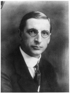
The De Valera Museum and Bruree Heritage Centre is dedicated to Eamon de Valera, former president of Ireland and one of the country’s most famous statesmen.

This image of Eamon de Valera in 1922 is from the National Photo Company collection at the Library of Congress. There are no known copyright restrictions on the use of this work. Click here to access the image file and record.

Eamon de Valera’s political career spanned over half a century, from 1917 to 1973. He served several terms as the head of government and led the efforts to ratify the Constitution of Ireland.

One of de Valera’s most famous speeches was entitled “The Ireland that we dreamed of.” Click here to listen to the audio of the 1943 speech, below is an excerpt sponsored by Raidió Teilifís Éireann (RTE), Ireland’s National Public Service Broadcaster:

“…The Ireland that we dreamed of would be the home of a people who valued material wealth only as a basis for right living, of a people who, satisfied with frugal comfort, devoted their leisure to the things of the spirit – a land whose countryside would be bright with cosy homesteads, whose fields and villages would be joyous with the sounds of industry, with the romping of sturdy children, the contest of athletic youths and the laughter of happy maidens, whose fire sides would be forums for the wisdom of serene old age. The home, in short, of a people living the life that God desires that me should live…”

The museum houses a collection of his personal belongings, as well as a wide range of articles which record life in Bruree in the early twentieth century. There is also a visitor centre where Eamonn de Valera grew up.  In the village of Bruree, the cottage where he lived has been preserved and the national school he attended houses another museum dedicated to his memory.

I look forward to learning more about Ireland in this process and to contributing to this very important project.

Mary Ellen Pethel, Ph.D.
Harpeth Hall School, History Dept. Chair, Digital Humanities Coordinator
Belmont University, Honors Program Adjunct, Global Leadership Studies Fellow

References:

“De Valera Museum & Bruree Heritage Centre” Visit Ballyhoura  (Ballyhoura Failte: Ballyhoura County, Ireland), 2018, http://visitballyhoura.com/index.php/2015/07/22/de-valera-museum-bruree-heritage-centre/.

“Eamonn De Valera, head-and-shoulders portrait, facing front,” Library of Congress (LOC Prints and Photographs Division: Washington, D.C.), 1922, http://www.loc.gov/pictures/item/00652544/.

“The Ireland That We Dreamed Of” 1943.” Éamon de Valera (1882-1975). RTÉ Archives. March 1943.

Categories
Uncategorized

Digital Public History: Place and Mobility

What a timely module for me as I continue to develop my project, Nashville Sites. The process in thinking about and executing this project mirrors the complexities of doing digital public history specifically tied to a place. In my case — that place is Nashville, Tennessee.

Our readings discussed the use of Storyteller (World War One: Love and Sorrow), responsive design (Beyond the Screen), combining oral history and place (Cleveland Historical), and augmented reality (PhillyHistory.org).

According to Deborah Boyer and Josh Marcus, “Learning about the history of a neighborhood in a classroom is educational, but actually standing in a neighborhood and comparing historic images to the present landscape can inspire students to engage more deeply with the past” (“Implementing Mobile Augmented Reality Applications for Cultural Institutions”). I couldn’t agree more. Speaking of more, my goal for Nashville Sites also includes a public audience in addition to students and scholars. Further sub-dividing, my audience is also composed of Nashville residents as well as a wide range of visitors to the city.

The Cleveland Historical site is nearly identical to Spokane History and feature walking tours and geo-spatial mapping. However, they are not as engaging for the mobile user. The text is lengthy and rather than giving the user the opportunity to view the site with a lead-in line to draw them to the longer description, the only option is to view the longer description. It also lacks the navigability and mapping options utilized by the Histories of the National Mall.

The PhillyHistory is a much bigger project that involves augmented reality using historic photographs in real-time and place. They began with a small sample size but have now incorporated thousands of images. This project involved a system called Layar. It was interesting to think about the two categories of applications: GPS-based and computer-vision based. As authors Boyer and Marcus note, “GPS-based applications make use of a phone’s GPS and accelerometer, gyroscope, and other technology to determine the location (particularly in urban areas), heading, and direction of the phone.” Most impressive has been the response to PhillyHistory (and this article was published in 2011): the site has 6,400 registered users and regularly receives and average of 13,000 unique visitors per month. These metrics remind me that I need to circle back to the MHC to see just what the stat counters say for the nashville.gov site that lists Nashville’s historical markers. The director told me it had the most traffic, but I need to get firm numbers.

World War One: Love and Sorrow is place-based public history but focused on a different type of location. Rather than an urban environment, it seeks to create a unique user experience in Museum Victoria. It does a nice job of storytelling and creating an engaging narrative as users can progress through the museum while also choosing and following one individual’s story (an actual veteran of the war) that features accompanying primary source documents. The project creates a compelling and personal narrative that makes the museum and exhibit more exciting for the patron/user.  While a great project, with some elements that made me think about how to create a compelling narrative within my own project, this place-based history is equally, if not more, thematic. The place is the museum, which drives the project technically but not theoretically.

The final article “Beyond the Screen,” was so relevant that I read it twice. It really helped inform me in thinking about my own project. I spent quite a bit of time taking notes and internalizing concepts such as graceful degradation, responsive design, progressive enhancements, and the triad: 1- What they want, 2- When they want it, 3- How they want it. John Falk’s description of the five visitor/motivation types was also extremely useful: 1- explorer, 2- experience seeks, 3- recharger, 4- professional/hobbyist, and 5- facilitator. Several museums and projects were referenced as well as new  technologies that I’ve since checked out, which include: Foursquare, Field Trip, Google Street, and Google Now. I learned a great deal from this white paper in general, but it also made me conceptualize my own project in a more objective and productive way. For example, I could easily include a guest survey to get feedback, create a journey map, and use Neatline to create a timeline that would create a chronological complement to the place-based history I am trying to create.

Audiences, and people in general, have an attention span that averages 3-12 seconds. With that in mind, I have to find a way to get the audience to the site and find ways to keep them interested. As the authors of “Beyond the Screen,” conclude: “While content is kind, if even the bride-to-be doesn’t notice her very own diamond ring in a case in front of her, it’s worth investigating new modes and opportunities that create responsive, customized experiences that entertain, engage, and enrich.”

Works Cited:

Hart, T. and Brownbill, J. “World War One: Love and Sorrow – A hybrid exhibition mobile experience.” In Museums and the Web Asia 2014, N. Proctor & R. Cherry (eds). Silver Spring, MD: Museums and the Web. Published September 19, 2014.

Baer, Brad, Emily Fry and Daniel Davis. “Beyond the Screen: Creating interactives that are location, time, preference, and skill responsive.” MW2014: Museums and the Web 2014. Published February 1, 2014.

Tebeau, Mark. “Listening to the City: Oral History and Place in the Digital Era.” Oral History Review 40.1 (2013): 25-35.

Boyer, D. and J. Marcus. “Implementing Mobile Augmented Reality Applications for Cultural Institutions.” In J. Trant and D. Bearman (eds). Museums and the Web 2011: Proceedings. Toronto: Archives & Museum Informatics. Published March 31, 2011

Categories
Uncategorized

Connecting the Public to Public History

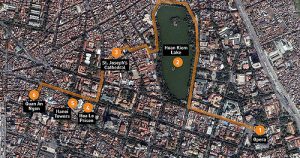
Nam-ho Park, “A Half-Day Walk through Hanoi,” CC license

There are many implementations and activities that can connect the public to public history using online digital collections. As Sheila A. Brennan and T. Mills Kelly wrote in 2009, the digital humanities are comfortable with the “read-write web.” The Web 2.0 (or 1.5 as they call it) allows public historians to collect and share the stories and narratives of people through their direct participation. Digital history project also benefit from the volunteer efforts of people to identify and enhance their narratives, help to piece together the narratives of others, and provide valuable information and context.

A great example of this can be found in the project “Invisible Australians” that used a facial detection script, tagging, photos, and people to analyze the “White Australia Policy.” Other successful crowdsourcing and public history collaborations include Flickr Commons,  created as a “forum for institutions to share their rich photographic collections. . . and provide insights into how knowledge, skill, and abilities of librarians, archives, and museums can converge in the Web 2.0 environment to provide collection access to new. . . audiences,” (Smithsonian Team Flickr). The Smithsonian Institute’s collaboration is sharing its rich photo archive with Flickr Commons has created an amazing public-private partnership.

In this spirit, the following list includes the kinds of public history implementations and activities that having a basic digital collection enables. 

  1. Tagging, Identification
  2. Transcribing
  3. Exploration
  4. Social Media
  5. Contests
  6. Visual analysis
  7. Direct Collaboration
  8. Geo-spatial mapping (see image at top of post)
  9. Memory-making
  10. Storytelling

Omeka has emerged as the premier platform for open-source digital public history projects.  With a variety of templates, plug-ins, and customization options, most of the items on the above list can be achieved using Omeka’s open source web platform.  For my own project, I will be able to use information from and about historical markers in Nashville’s downtown core. This includes temporal and geographic locations, marker text, and related primary sources. These resources could ultimately be used to create explorations via walking tours, contests for users, storytelling via historical contextualization, direct user collaboration via tagging or identification, and social media. While many of these goals remain quite distant, the fluid nature of DH and the trajectory of rapidly advancing technology make these goals possible.

It remains important to consider several factors that remain critical to the long term usefulness, credibility, and sustainability of digital archives. First archival projects need to be clearly identified. There are many genres and meanings of the word “archive” as noted by Trevor Owen. Ranging from a records or storage management system to what some critics call “artificial collections,” properly defining the mission, scope, and function of an a digital archive is essential (What Do you Mean by Archive?). Likewise the issue of metadata is important. Metadata is not always exciting on its face, but it provides the foundation on which successful digital history projects depend. As the guide for “Describing Metadata” suggests: “Metadata is the glue which links information and data across the world wide web. It is the tool that helps people to discover, manage, describe, preserve and build relationships with and between digital resources” (Describing Metadata).

Coupled with high standards of historical scholarship, digital projects can produce and make available large collections that can be used to disseminate and distribute information to the greater public while also providing countless primary sources to current and future historians. As Dan Cohen and Roy Rosenzweig emphasized in Digital History, “Collecting history through digital archives can be far cheaper, larger, more diverse, and more inclusive than traditional archives. This democratization however, does not mean compromising the quality of the historical work.” (Why Collecting History Online is 1.5).

Works Cited:

Brennan, Sheila A., and T. Mills Kelly. “Why Collecting History Online is Web 1.5” Roy Rosenzweig Center for History and New Media. 2009.

JISC Digital Media. “Metadata: An Introduction.” (first section – “From Metadata: a definition” to “Metadata often reflects the community it has come from.”

Kalfatovic, Martin et al. “Smithsonian Team Flickr: a library, archives, and museums collaboration in web 2.0 space.” Archival Science (October 2009).

Owens, Trevor. “What Do You mean by Archive? Genres of Usage for Digital Preservers.” The Signal: Digital Preservation (blog), February 27, 2014.

Sherratt, Tim. “It’s All About the Stuff: Collections, Interfaces, Power, and People.” Journal of Digital Humanities 1.1 (Winter 2011).

Categories
Uncategorized

Visual Tools: Voyant, CartoDB, and Palladio

New web-based, open source technology has dramatically shifted the landscape of digital humanities. It has affected fields related to  digital humanities in two significant ways. For institutions and digital humanists a new quest to create, build, and host project sites has emerged. These digital projects allow users to interact and manipulate data in specific ways that yield almost infinite combinations. For users, these digital projects have laid the groundwork for moving research beyond the archive and to digest and draw conclusions based on datasets and information expressed through new macro-based visuals. The projects/programs reviewed here focus on textual analysis, geospatial mapping, and visual graphing based on large sets of metadata and archival information.

Voyant
Strength/Weakness: The strength of Voyant is the range of text analysis provided: cirrus, networks, graphs, context, verbal patterns. This is also its weakness. At first glance it’s very impressive but when trying to set or manipulate certain features available to the user for the purposes of customization or multiple datasets, the program does not function well.
Similarity/Difference: Voyant is similar to CartoDB and Palladio in that they are all free open-source, web-based programs. Voyant and Palladio do not require usernames or passwords. Voyant is different from CartoDB because CartoDB does require a sign-up. Voyant is different from Palladio because Voyant has one main screen with several visual fields, while Palladio only focuses on one type of visual analysis at a time, i.e. maps or graphs.
Complement: Voyant provides sophisticated text analysis and CartoDB provides sophisticated geographical analysis. Paired together, they provide unbelievably rich yet simple ways to “see” data relationships. Palladio and Voyant complement one another because they allow users to layer and filter the same data to produce different types of word graphs, clouds, and networks.

CartoDB
Strength/Weakness: The strength of CartoDB is the visual clarity and graphic options for its maps. The program’s weakness is that it really only serves to create maps and not graphs or other visual organizers. As a side note, this could just as easily be a strength because it does one thing well.
Similarity/Difference: CartoDB is similar to Palladio in that it focuses on one type of visualization, which it does very well. It is different in that its foci are  maps=CartoDB and graphs=Palladio. CartoDB is similar to Voyant on a basic level; they both produce visual graphic representations of the relationships within a large set of data. They are different because Voyant attempts to do many things (but not geospatial mapping), while CartoDB focuses on geography and not text.
Complement: CartoDB and Voyant complement each other well for the same reasons that they differ (above). Voyant does what CartoDB does not and vice versa, so together they provide an even more comprehensive picture of patterns that can be draw from data. Palladio and CartoDB complement one another because each does a different thing well. I would be tempted to use these two rather than Voyant because they are both user friendly.

Palladio
Strength/Weakness: The strength of Palladio is its relatively easy interface and the ability to drag and organize nodes and lines. The weakness of Palladio is the inability to save projects in formats other than svg or json, and that beyond the visual graphing network there is no additional information.
Similarity/Difference: It is similar to CartoDB in that it does have a map function, but Palladio is different because the most effective feature is visual network graphs. Palladio is similar to Voyant in that they both have word links and network features. They are different because Voyant is difficult to use (because of glitches not design), while Palladio is much easier to use.
Complement: Palladio complements Voyant by providing more options for word clouds and visual networks. Palladio provides a complement for CartoDB as they are both based on layering datasets manually with selecting different modes and filters.

As these open-source programs continued to “hone their skills” and “work out the kinks,”  they will no doubt provide continued and enhanced methods of data analysis that can be customized for and by individual interests.

Categories
Uncategorized

CartoDB Reflection

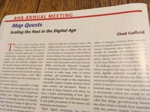
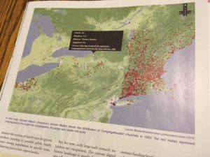
Once again, the timing of HIST680 is impeccable. I had just finished reviewing CartoDB when I went to my mailbox and pulled out this month’s Perspectives published by the AHA. The topic of one of the feature articles? You guessed it: digital mapping.

img_3398

img_3397

This simply reinforces my belief that taking this course and participating in the DH Certificate Program through GMU was not only a good decision, but a great one. Now onto my review….

heat_alabama_interviews_cartodb_1_by_mepethel_10_23_2016_10_16_35

CartoDB (created by Vizzuality) is an open-source, online, cloud-based software system that is sure to please anyone seeking to visualize and store data using geospatial mapping. Basic usage is free with an account; however, better and expanded options are available with a paid subscription. The company also provides support and custom mapping for an additional fee. The free account is accompanied by 50mb of storage, and data can be collected and directly uploaded from the web and accessed via desktop, laptop, tablet, or smart phone. Part of what makes CartoDB so intuitive is its user-friendly interface. Users can upload files with a simple URL cut/paste or file drag/drop. The program also accepts many geospatial formats, such as excel, text files, GPX, and other types of shapefiles, making CartoDB useful for humanities and STEM-related disciplines alike.  Once multiple data layers are uploaded users can create a visualization and manipulate this visualization through several modes: heat, cluster, torque, bubble, simple, and others. Once the visualizations have been organized and customized, CartoDB also provides convenient options to provide links and embed codes to share the map. Finally, CartoDB does a great job answering questions with online tutorials, FAQs, and “tips and tricks.” Google maps first ventured into web-based mapping tools, but CartoDB takes it to a whole new level.

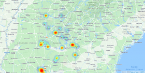
Our activity involved using data from the WPA Slave Narratives, and it was a great hands-on exercise to discern the types of information and conclusions that can be drawn by viewing information geospatially. By visualizing the location of interviews it works much like Photogrammar (Module 8), which allows users (teachers and students alike) to see several patterns: travel, chronological, and the geographical concentration of interviews in particular areas of Alabama.

While our class activity provided the data, I am anxious to experiment with data that I have collected myself. For example, I am working on images and maps for a recent manuscript, I have the addresses for several colleges and universities in Nashville. I received an email last week from the press that said they were unable to take my historical maps and provided layered data which would show the relationship between the location of institutions of higher education and the geographical trends of urban growth in Nashville from 1865 to 1930. I look forward to using CartoDB in the future.


css.php